Wednesday, 30 March 2016

Evaluation: Question 7

Looking back on the preliminary task, what do you feel you have learnt in the progression from it, to the full product.


 As the preliminary task was our introduction to the AS Media course, it is very basic. We have learnt a lot since then.The video quality was not to the standard we would prefer. The camera we were using had poorer recording quality than we were looking for. This coupled with the accidental format we saved it in resulted in a blurry image. We did not use the same camera, or format for our final piece because of this.
During this production, we used a range of different required shots, however, during the editing, we noticed that we had broken the 180° rule. We mentioned this in our Evaluation for our his task.


As the final piece is toward the end of our coursework, we had learnt a lot more about camera angles, shots and movements, editing techniques and stereotypes within films similar to our own.
After the initial filming of the final piece, we were able to put the raw footage/rough cuts in as our first draft. After this, we were able to make small changes, such as audio, shot editing, voice over and colouring, to each draft leading up to the final piece.


So, what have we learnt?
Overall, between the preliminary task and the final piece, we have learnt many things, including a range of different camera shots, angles and movements, how to use different editing software and how simple things much as background audio can create different affects on the audience.


go through specific things - individual camera shots
at least 8-10 e.g.


Evaluation: Question 6


What have you learnt about technologies from the process of constructing this product?


When making this product we has to use a range of different pieces of software and hardware, below is a post about the software used. To view the hardware we used click on this link and it will take you to a planning post about some of the hardware used. 


Powered by emaze

Evaluation: Question 5

How did you attract/address your audience?

After completing the introduction to our product, we sent out an Online Questionnaire to people we knew had viewed it, asking them their age, gender, what films they'd normally watch and how they heard about our product. We received 10 Responses in total.  

Our collected data showed that :


85.7% of the people who answered our survey were between 16 and 19 years of age. This statistic shows that we have successfully hit our target audience, as we were aiming for people within Group E, aged between 15 and 20.


Out of interest, we included a question asking their Gender, to see who was more interested in our production - who we appealed to more. We originally aimed to interest Females, more than males with this product, by using a Female actress. Interestingly, our survey showed that more males than females answered our survey, with 71.4%.


Within our survey, we asked how the viewer heard of our production. 57.1% of the people said they heard of out product through word by mouth, and other said Friends of the producers - Matt and I. This to me, indicated that we should have advertised more, to spread the word of our production.


We attempted to address our audience by using a teenage actor - Heather - for our main character. We did this as it provides the audience a character they can relate to in terms of emotions. The teenage audience will be able to relate to the main character, better than someone of an older age, as they are the same age.

(Our group has completed the same evaluation as we all contributed equally to each post.)  


Evaluation: Question 4


(Our group has completed the same evaluation as we all contributed equally to each post.)  

Evaluation: Question 3

What kind of media institution might distribute your product and why? 

We believe that production company that have produced and distributed successful supernatural horror films, similar to our own, would also be interested in distributed our product as well. 


A film similar to our own:


The Woman in Black is a supernatural horror film produced and distributed in 2012. The film was also our main inspiration, as it was different to the rest of the class's initial ideas (and final pieces). The film is about a mother who suffers he lose of her child. Following the lose of her child, she commits suicide, freeing her spirit. After her suicide, her spirit begins attacking and murdering the children in the near by village, as she feels it is unfair her child dies, and the others are allowed survive.

Their synopsis :
"Arthur Kipps (Daniel Radcliffe), a lawyer, is recently widowed and grieving the loss of his wife when he is sent to a remote village to put a deceased eccentric's affairs in order. Soon after his arrival, it becomes clear that the villagers are hiding a terrible secret. Kipps discovers that his late client's house is haunted by the spirit of a woman who is trying to find someone and something she lost, and that no one -- not even the children -- is safe from her terrible wrath"

Our synopsis is very similar. Mother loses her child in birth, commits suicide following the child's death and then her spirit attacks the remaining 4 children that survived their births in the hospital that very same day.

Who distributed The Woman in Black? :


Momentum Pictures

EOne Momentum Logo.jpgThis is one of the companies that distributed The Women in Black in 2012. Founded in London 1966, Momentum pictures is a distribution company that was originally one of the leading independent motion picture distributors in the UK and Ireland.

They may have been interested in distributing our production as it is similar to one of their already existing, successful products - The Woman in Black, as well as Sinister,  My Soul To Take and Let The Right One In. (These links will take you to their trailers on YouTube.)


Another film similar to our own:

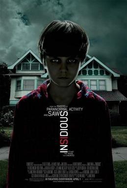
Insidious poster.jpg
Insidious is another film that is a supernatural horror film, produced and distributed in 2010. This film inspired us to edit, and adapt our synopsis to involve Procession, and the sense of a child being haunted. The film is about how a family that struggles to deal with a spiritual presents after moving to a new house. This paranormal activity seems to be centred around one of the children - Dalton. This is what gave us the idea to have our spirit target 1 child. The rest of their synopsis will be shown downstairs.

Their Synopsis:
Renai and Josh, with 3 children, (baby girl Cali, and older brothers  Dalton and Foster) move to a new house in a new area. Shortly after their arrival to this new house, one of the children - Dalton - is drawn to the attic after hearing noises, and seeing his bedroom door open by itself. During Daltons attempt to get into the attic, he falls from the ladder, and then sees a scary figure in the shadows. After screaming for help, his parents make the attic "off limits" to the children. A few days later, Dalton slips into an unexplainable coma. After 3 months of treatment without results, the family are told they can take Dalton home. Soon after his return home, supernatural activity begins again. Renai begins hearing voices over the Baby monitor when no one is in Cali's room, and she sees a frightening figure of a man in Cali's room, who vanishes when Josh enters, as well as the burglar alarm being set off with no reason and the family finding the front door wide open. The film continues with the family bringing paranormal investigators who sense a presents in the building, and ends with the father being processed after attempting to reach his son, Dalton, in a spiritual sense. After the fathers procession, he murders one of the paranormal investigators, and disappears.


Who distributed Insidious?

Alliance Films

Alliance Films logo.JPGAlliance films is a Production and distribution company that distributes in UK, Canada and Spain.

They also own Momentum pictures.


They may have been interested in distributing our production, as they have distributed other successful supernatural horror films similar to our own - Insidious, as well as Sinister, Let Me In, and The Ward.  All these films have similarities with our production, suggesting that this company may have been interested in distributing our product.


(Our group has completed the same evaluation as we all contributed equally to each post.)  

Evaluation: Question 2

Powered by emaze


(Our group has completed the same evaluation as we all contributed equally to each post.)  


Tuesday, 8 March 2016

Pictures taken during filming


Changes during filming


-Changes to the official script.
While we were filming, we noticed that changes to the script had to be made. We will put a new script up, and leave the old one in to show all the changes we had to make. The Arc movement around the main character had to be changed as we could not get a smooth shot. The medicine bottle we talked about in the script was not obtainable during filming, so we ended up cutting that out as well. 
-No black figure standing behind the main character in the last scene of the introduction.
During the editing, we saw that having the black figure in the background, then fading out, made the introduction look like a trailer. We decided to leave this part out, we think it looks better without it. We have included a black figure in Draft 5 and 6, but it is in a different cut, straight after the arc to the main character.


- no medicine bottle.

During the day of filming, we were unable to find the medicine bottle we were planning on having, meaning we had to cut the idea out. we have been able to work around this.


- no outside arc around the character at the start.

Though we have practiced Arc Shots, we were unable to get a smooth turn ... Since the arc wasn't smooth, the shot looked unprofessional, so we decided to cut that out as well. We have also been able to work around this, as it has given us the opportunities to cut to different short-cuts that make the introduction more interesting for the audience.


- location of orchard scene

We were unable to film in the orchard on the day we had planned to film due to the soil conditions. The night before, it had been raining heavily. This is why we left the orchard scene filming till about a week later, where we could then film it in the school field. We decided to use the school field as it is surrounded with trees, and offers shady areas we could use for the silhouette.   
We also took a range of different shots, which later on, could be used to make the silhouette appear to be moving, almost like teleporting ... In a spirit like fashion. We can edit the shot to make it jumpy as well, creating a sense of fear.


-The opening title.

During production, our draft title began to annoy us. It wasn't meeting the standards we were expecting, so we looked into new animated titles. The 4th Draft contains the new title animation that we intend to keep for the final piece. We believe this new title works well with the opening, and related well to the "time" used within the title ("your time is up"), as the letters appear to be counting down. The colours also relate to the opening of the film - White=Innocents /  Black=Deceit  / Red=Blood & Death


Final piece


This is our final piece. We have gradually made changes based on the feedback from our target audience. This draft differs from Draft 6 in volume of the music. we chose to do this because when we showed a sample of our target audience, they said the music in the background was too loud, and that it was difficult to hear what she was saying. We have now corrected this. The music is now quieter when she is speaking, and louder when she is not. We have shown this version to the same people and they have said it is now easier to understand what is happening.
We also, upon receiving feedback from peers, changed the length of the title. This was because the audience couldn't read the title properly as it faded out too quick so we extended the length of the title at the end so the audience could read it. Whilst extending the length of the title we decided to sort out and fix the blue flicker within the title.
We are very happy with how this piece has come out, as we have been successful in creating the emotional affects that we intended in the audience. Certain aspects of this have changed from what we were originally planning, but we believe it still works.


Friday, 4 March 2016

Change in title ideas

In our opinion, the previous title did not look as professional as we were hoping, especially once we had seen it in a few of our drafts, so we decided to change it. We believe the new title (that is in the 4th Draft) works much better, and looks much more professional than our previous one.

   
We have chosen to use Black, White and Red in the creation of this title because all of these colours can be easily links to the genre of the film (horror). The White is used to represent innocents, whereas the Black is to represent deceit. The red in the title is to represent blood and the death that is in the opening of the film. 

6th Draft


We have used the same music as before, in the previous draft, but after getting some feedback from our target audience, we saw that, after the titles, the background music came in too loud. This is why in this draft, we have lowered the volume of the background music, and attempted to fade it in. We believe that this has allowed the audience to feel the atmosphere of horror for what it is instead of having to focus on either the music or the voice-over as they competed in previous drafts.

5th Draft


In this draft, we have changed the background music. We believe this music works better with what is going on. The music we were using before made the introduction seem like a trailer, so we decided to look into different musics. This is the one we have chosen for this, and the next draft. We will get some feedback from our target audience (teenagers in Group E) and decide wither or not to change it.

We have added another production company to this draft. We have made this production company title and animation as well. We've done this because most films of our genre have more than 1 production company. 

Tuesday, 23 February 2016

4th Draft


The new animated title has been added to this draft. We believe this title works much better with the opening, as it looks more professional than the previous title.

We still need to work on the background music to this draft before completing the final task. At the moment, in this draft, the background music is making this sound like a trailer. We are still looking into other background music that we believe would work well in creating the affects we wish to achieve in the audience. We have been looking at other background music used in movie openings similar to our own. Hopefully we will have a more successful soundtrack to the next draft.

3rd Draft


We are still looking into the title. We have been looking at different animated titles, used in other movies that have the same genre and sub-genre, and have come up with some more ideas. The new title will be included in the next draft. The credit terminology has also been corrected. We are still looking into background music alternatives, but a background track has been added. We believe this has added affect to our opening. 

Wednesday, 17 February 2016

2nd Draft


We are still looking on alternate animated titles, and hopefully they will appear in the next few drafts. We still plan to use the same 2 colours - Black, Red and White, to keep the affect they have on the overall appearance of the title. Another post will be made, looking at the title and why we have chosen it. 
We are also, still looking into background music. We have been experimenting with different background music, but we have not yet found the right one yet. 

Credits have been added, however, we have been told that the wrong terminology has been used. We will fix this within the next few drafts. 

Wednesday, 10 February 2016

First Draft


This is the first draft of our final piece. This needs a lot of improvements to achieve the effects we desire for the audience. We will make these improvements over the coming weeks. 

One of the changes we plan to make is to the title. The title used in this draft, was a drafted, animated title. We are still looking at alternatives for the title used in this draft. Our new title will hopefully appear in one of the few drafts to come. 

Another change we will defiantly be making will be the audio. We are missing backing music in this draft. The music will add to the sense of curiosity, and fear at the same time. It will also be copyright free. 

We also need to add the credits. Acting by Heather Paterson, Editing by Matt Bartram and Filmed by Rachel Nesbitt. These credits should appear within the first 2 mins of a horror opening, we plan to have ours appear within the first minute. 

Saturday, 16 January 2016

Forecast planning

As the forecast changes over the week, we will do daily updates on the weather, to see what the weather is most likely to be when we are filming. Are expected date to begin filming is Saturday 16th January 2016. Ideally, we would like it to be dry, and cold (so that you can see the character breathing as she walks down the road).


This screenshot of the forecast was taken on the Monday before filming (11th). 

This screenshot was taken on the Tuesday before filming (12th)


This screenshot was taken on the Wednesday before filming (13th)
This screenshot was taken on the Thursday before planning (14th)

This screenshot was taken on the Friday before planning (15th)


What was the weather like during filming?
During filming, it was sunny, windy and very cold outside. Thankfully, we got the filming outside done first. The east of the filming was completed inside. It wasn't to dark as we decided to film around 1 o'clock. The level of light we would like can be edited into our final opening piece.


Friday, 15 January 2016

Camera diagrams

We will use the same numbering we used for our story board for this post:

  
1&2:  The titles do not require any camera placement, so we will skip these 2 frames.
   

3:


4: As this is a close up of the characters face, i wont create a diagram for this shot. 

5:

6:


7:


8:


9:


10:


Physical Timeline for our introduction

Wednesday, 13 January 2016

Camera panning

 In this post, I will be talking about the 2 main ways of panning a camera, which will be more effective in our production and why.

First of all, What is Camera Panning?


Pan1.gif


Camera Panning is when you rotate the camera from left to right, or right to left (As shown in the image). This is a very popular camera movement in the media industry as it shows exactly what the producers want the audience to see, without having to take more than 1 shot.


There are 2 main ways to pan a camera. Hand held panning, and Tripod panning.

Handheld panning is when somebody is holding the camera, and rotates the camera by twisting with it.
Tripod panning is when the camera is placed on a stand, that can rotates with a handle.

Which is better?
Tripod panning is much smoother than a handheld pan, as the camera is on a fixed stand. A tripod can be set, so that is only rotates left and right, not up and down (and vice versa, however, if the camera is going up and down, it is not a pan, it is a tilt.). Handheld pans are not as smooth as peoples hands tend to shake while panning, which is picked up on the recording.   


Tuesday, 12 January 2016

Storyboard Animatic


9 Frame Analysis


This frame helps set the scene to the audience by giving them context about where the scene is happening and when. This allows the audience to connect to the film on a more personal level because it is from a time that they have already experienced. 


This frame helps the audience to understand the narrative of the film because this scene is actually from a previous Paranormal Activity film. 

This frame builds tension for the audience about the rest of the film. The black background in the frame as well as the text help to foreshadow darkness that is about to come. 

This frame is an important part within the film because it establishes a change of scene as well as time. The close up shot of the teenager helps to establish that she will be the main character within the film. 

The flickering of the light within the dark setting helps to create suspense as well as portraying the idea of supernatural horror within it. 

In this scene the audience are revealed to the child that plays a significant part within the film. The camera helps to foreshadow the supernatural horror to come because it peer down on the kids showing they are weak/vulnerable as if the supernatural being is watching them. 


In this frame we can see the camera is looking up at the young child helping to suggest the audience have under-estimated him. It also helps to foreshadow the tables turning in the favour of the young child due to him being portrayed as being dominant. 


In this scene the camera is taking a close up shot of the character looking straight at the camera. The idea of this shot is to create suspension by making the audience feel awkward and somewhat responsible for what is being foreshadowed. This is because the audience can see behind the child and what is coming but the child can't. 


This scene is all about building suspense, this is because the audience is left wandering who this figure is and what it's intentions are. Are they an antagonist or not?


Saturday, 9 January 2016

Editing Schedule

First: Once all the shots have been filmed then I need to go through the footage and delete the clips we don't need and put those we do need in order. This will make the editing easier to preform.

Second: One of the first things to do is insert the groups production company and the title for the production. 


Third: I need to insert all of the clips that I am going to use in the right order. When inserting each one I need to make sure they are all the right length. 


Fourth: I need to insert the music that is going to be used in the production. 

Fifth: Go through each clip adjusting the picture and sound. 


Sixth: Review the clip as a whole and rectify any mistakes.